What is a Mobile User Journey
So now that you have created vividly descriptive mobile personas, let’s integrate them into a mobile user journey to better understand the complete user experience.
A mobile user journey is a design framework that facilitates the mapping of the sequence of user activities and touch points that characterize a mobile app user experience. A journey map is a graphical visualization that charts the users’ level of confidence and patience when performing various touch points in a mobile interaction flow.
A mobile user journey is an effective tool that helps your organization to look at the complete mobile app user experience from the users’ perspective, from understanding their situation, actions, thoughts, feelings, emotional experience to touch points that allow your users to reach their goals.
Why Map a Mobile User Journey?
Design is not just about picking a color pallet that your users will find pleasing or coming up with a cutting-edge UI design. Great design requires holistic visual, interaction and emotion-focused user experience to create a mobile app that your users will absolutely love.
Before focusing on your mobile app capabilities, sound design should start from the organization of the system, and from the possible relationships and connections between the parts which can be activated by the user action.
The value of a mobile user journey map is that it illustrates the complexity of mobile app user experience, highlighting the questions that they ask, the issues that they raise, the roadblocks that they encounter in the journey timeline. From the user journey, you can gain invaluable insights into designing a mobile user experience that is relevant, efficient, usable, and appealing, all the while ensuring that each touch point evokes a positive emotion.
Rushing ahead without conducting a research-driven mobile user journey is effectively rushing to fail. You might end up with a mobile app faster but it will miss the mark because of the “we know what’s best for you” mindset, leaving you with an expensive experiment and a negative ROI to justify to CXOs.
Build on Mobile Ethnography
To extract meaningful and realistic insights, a mobile user journey must be grounded firmly on in-depth primary research. It has to be based on concrete, measurable data to craft the most realistic user journey. The more evidence you have, the more likely that you will be able to design a homerun user experience based on reality. If you follow the methodology prescribed in Amyx+’s Mobile Persona best practices article, you have a head start. During the ethnographic research and analysis for mobile personas, you can also conduct user interviews and observations to map out their journeys.
As you interview potential users, you will soon realize that mobile user journeys are not linear and can often take many forms. Depending on the persona segment and the situational need, there may be a myriad of paths to achieve a given goal. It’s important to note these complexities but not losing sight of the primary journey taken by the majority of your users.
Figure 1 Study Users Through Ethnography

Framework for Mapping a Mobile User Journey
Figure 2 Mobile User Journey Methodology
It’s important to remember that users are complex and their interaction with the mobile app in the journey will be equally complex with many paths weaving in and out. A good user journey map will give insight into the emotional and analytical aspects of users’ experience and help you to understand what users think and feel about every touch point and how those emotions prompt them to act.
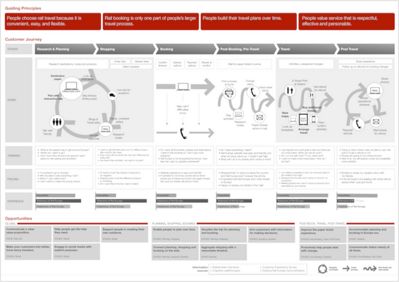
A well-constructed mobile user journey succinctly and precisely calls out the user scenarios, goals, actions, thoughts, feelings, and emotions to understand what is happening at each phase of the journey.
1. Guiding Principles
Turn your understanding of users’ needs into a set of guiding principles for your mobile user journey map. Use your guiding principles as pillars of truths that represent the objectives and desires of your users. For banking apps, users expect high mobile app security to protect their account information and financial transactions. For social game apps, people want the mobile app to be fun and engaging.
2. Phases of the Journey
Logically segment out the timeline into key stages. Depending on the subject matter nature of your mobile app, the phases will vary but it should, at the highest level, define the major and distinct stages in the mobile user journey. For a social media app, perhaps the user activities and touch points are grouped into download/ register, invite, share and follow. An e-commerce mobile app might entail research, compare, purchase and support.
3. Situation
The situation is a narration of the user scenario that describes what the user is doing in each stage and what actions do they need to take to move to the next phase. It should serve as the contextual hub from which user’s goals, choices, questions, pain points and uncertainties can be further explored under thoughts, feelings, and experience.
4. Thoughts
What are the rational decision-making questions and trade-off considerations that the user is mentally processing? Perhaps, they are weighing the cost-benefit of a transaction or evaluating the relevance of curated content. These thoughts represent the important questions and decision points that users need to sort out before they can confidently move to the next step.
5. Feelings
Behind every action is intent and motivation. Why is the user motivated to keep going to the next stage? What feelings are they experiencing? Are they overwhelmed by uncertainty, apprehension, confusion, frustration or distrust? Unmasking users’ feelings provide powerful insights into how best to overcome those points of potential indecision or abandonment.
6. Emotional Experience
As described in Amyx+‘ article “How to Create a Mobile App That People Love”, useful and usable are not sufficient conditions for a mobile app to be loved by users. If the mobile app experience does not evoke positive emotions throughout the user journey, your mobile app will receive a lukewarm reception. You have to hone in on the emotional troughs and rethink your design choices to shape the desired emotional state.
As a best practice, design your mobile app for emotion. What emotions will resonate with the user in the mobile user journey? Determine why each emotional state is desirable. Why will these emotions make your app experience compelling to your mobile personas? What visual and interactive features can you design to evoke the desired emotions?
7. Recommendation
Based on the insights gained across thoughts, feelings, emotional experience in the phases of the journey, make specific recommendations on ways to improve your mobile app user experience. This might mean collapsing the number of steps required to accomplish a task, communicating clearer instructions, reducing the number of choices or arming users with information to make decisions.
Figure 3 Sample User Journey Map

Conclusion
Building a mobile app that users love requires a fine balance of art and science. To make the process more science-driven based on quantitative data, develop a rigorous mobile user journey from ethnographic research. The mobile app user journey map can reveal the true colors of interaction touch points, remove barriers that can stand in the way of preventing users from proceeding to the next stage, and gain invaluable insights into the users’ emotional experience that can help refine UI navigation, interaction design, information architecture, and content decisions, resulting in a mobile app user experience that is usable, useful and emotionally engaging.


