With any good problem solving the first and the most important question that we should ask in developing a mobile app is what is the problem that the user is trying to solve? Perhaps the user is trying to view their balance in their checking account before making a big purchase to avoid an overdraft protection fee or a sales executive needs to know the latest sales pipeline status with a prospect before an onsite meeting. Framing up the problem properly is a critical component to an app’s success. Conversely, getting the problem wrong could mean the death of the app even before being launched. Understanding the who and why are fundamental to correctly framing up the context that will drive the mobile app design and development.
There are over a million apps in the iTunes App Store and nearly 700,000 Android apps. What is going to compel people to download your app over other apps? People need to know how it will significantly improve their lives. It requires designing apps that your target segment will absolutely love. In mobile, good enough isn’t enough. Just look at the countless hundreds of thousands of apps with no downloads or even if it’s downloaded, it becomes stale, never opened again or deleted at some point. In designing a mobile app, the user experience has to hit the bull’s eye. Any misses will mean that your app will be in the App Store graveyard.
Figure 1 Million Apps on the App Store… and Growing
1. What is the pain point?
A mobile app must solve a problem that current apps cannot fully address. It must provide core functionality that allows a user to fulfill a goal. The challenge here is that more often than not we believe that we know the pain points. Unless your assumptions are challenged, you will end up creating a me-too app that collects dust on the App Store shelf.
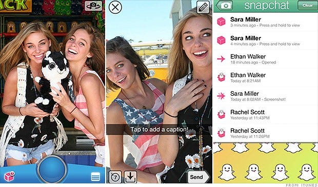
Let’s take Snapchat as an example. They were not trying to solve the “ability to share photos” problem since there are hundreds of photo sharing apps. Rather, they realized with their target demographic of tweens and teens, this segment wanted an ultra-private sharing experience without the constant surveillance of their parents, relatives, and not-so-close friends looking over their shoulders. The problem was that they didn’t want to leave a footprint of their social network where potentially it could get in the hands or view of people other than the intended party. Hence, Snapchat understanding this nuance built a picture chatting app that self-destructs the photo message within seconds, as set by the sender. This is in complete contrast to Facebook Timeline which persists the user’s life story through photos, friendships, and personal milestones, conceptually, forever or at least until the next acquisition or demise of Facebook. In sum, if the problem seems obvious to you, then it’s likely that the problem that you are solving is the wrong problem or an aspect of the problem but not the bull’s eye.
Figure 2 Snapchat Real-time Picture Chatting App on iOS and Android
2. How easy is it to use?
There is no faster path to abandonment than a poorly designed app that is not usable. Great functionality means nothing if it is hard to use. When there is another app with similar or even less functionality in the marketplace but it’s easy to use, then all other things being equal, people will choose the more usable app. In another article, I will elaborate on mobile flow mapping that can help identify usability areas and ways to collapse down unnecessary steps in the app workflow.
To illustrate the point of poor usability, let’s juxapose two mobile video chat apps – Tango and Paltalk.
Figure 3 Tango (left) and Paltalk (right) Video Chat Apps on Android


Both offer front-facing camera integration and video chat functionality for face-to-face conversations with friends and colleagues over Wi-Fi. Beyond that commonality, they are miles apart in the user experience. Though Tango has limited video/ voice calling functionality with no options for group video calling or even IM support, it’s a synch to use. The app’s simplicity is what makes it appealing. Open the app, select your contact and now your face-to-face chatting.
Then you have Paltalk. In addition to video calling, it can create video chat rooms to show your face to perfect strangers. On the above screen, there are too many calls to action with ambiguous icons. The user interface is not striking. The app fails to persist user settings. Log in takes forever… all recipes for failure.
3. Do they love it?
This is the qualitative dimension that most app developers rarely get it right. Does it evoke positive emotions? Addressing the pragmatic aspects of usefulness and usability in themselves does not translate into a mobile app homerun. The time spent on the app has to be enjoyable. How do you design with desirability in mind? The user experience has to appeal to the senses, perhaps it conveys exclusivity, the user is with the in-crowd; or the feeling of great productivity and efficiency after completing a task.
In Built to Love: Creating Products that Captivate Customers by Boatwright and Cagan, there are emotions that your mobile app should engender, ranging from independent, secure, confident, powerful, passionate, compassionate, content, optimistic, joyful, proud, sensuous, adventurous, honorable, luxurious, connected to distinct. To really make users love your app, design your mobile app for emotion. What emotions will resonate with the user in the mobile context? What user interface design and features can you design to engender the desired emotions?
Flipboard is one of the apps that people love. Let’s examine why.
Flipboard is referred to as a social news magazine but for all-purpose it is a RSS aggregator of social media and news content. There are plenty of alternatives for such information – Google News, major media apps, etc. But what sets Flipboard apart from the pack is the emotional experience.
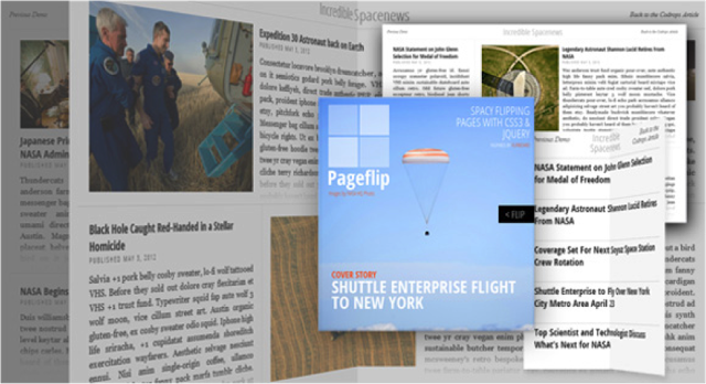
Rather than other similar apps that try to port the web experience onto smartphone and tablets without any consideration for the mobile use case, context or form factor of the device, Flipboard uses it’s marquee “flip” paradigm into the mobile UX context. Using the flip cue finger gesture, it folds the page as it transitions from one page to another. In the forefront and center of the experience are the prominent photos that connect directly to the emotional senses. Without much effort, a user can quickly cycle through large streams of content efficiently while fully immersed in the user experience. Now, that’s loving it.
Figure 4 Flipboard Social Magazine App on iPad
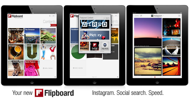
Figure 5 Flipboard Flip Effect
“I love apps that let’s me do what I want to do in the most elegant way. A pleasant app experience beckons me to come back.”
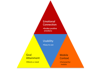
In sum, developing a mobile app that your targer users will love takes a fine-balance of understanding the goal that they wish to accomplish, building with usability in mind, and designing the app experience to evoke positive emotions, all within the mobile context that is fundamentally different from the web.
Figure 6 Framework for Building a “Loved” Mobile App